A problem constantly faced by stationery lovers is owning an abundance of something stationery related. Though these objects of endearment inspire creativity and joy, they can also be sources of worry– am I hoarding? At the beginning of this year, I finally read Marie Kondo’s The Life-Changing Magic of Tidying Up. While parts of the book can give most 21st-century dwellers a wake-up call, thanks to consumerism and relative stable and prosperous societies we live in, I see truism in Kondo’s angle and approach. An integral part to Kondo’s method is to handle each piece of object that you own and ask the question, “does this thing inspire joy?” To put this in practice, I decide to swatch all full-size ink bottles I have. It has been a project that looms in the back of my head, but now it can serve several purposes:
- My first step in tidying up
- Inventory colors I have
- Good tool for future ink comparison
For the paper, I have considered using Maruman Mnemosyne Word Book as the swatch paper, not only the product has been discontinued, but I also want to use something I already have for this project. Using Canson XL Mix Media paper (98lb/160gsm) that is heavy enough to withstand light layers of wash, I trimmed out cards that are 2.5 x 3 inches in size. Instead of using cotton swabs, I used two size 6 round watercolor brushes. In the earlier years, I have used cotton swabs to make swatches but I have found them unsatisfactory. Even though swabs are absorbent, the amount of ink laid on paper is disproportional. Waterbrush, in contrast, can load up lots of ink (as it is designed to do!) and thus capable of showing color gradation better than swabs. However, the downside of brushes is the possibility of contamination– ink residue lingers on brush fiber, so careful and thorough rinsing is pertinent.
I have been happy with the swatching results. The brightness of the paper reflects colors accurately. Because of the initial dipping usually carries a lot of ink, sheen and nuances are magnified, along with shading property. The downside of it is that the paper began to buckle slightly, but by in large, each swatch stays flat. These swatches will come in handy for future ink reviews, as now I can place the color side by side for more subtle comparison. More importantly, handing each ink bottle in a tangible way invokes memories I have associated with each color (i.e. how I came to purchase the ink, where I bought the ink, recalling of experience while using it). They do bring joy to my life!
In case you are interested in the ink collection, here is what I have:
Caran d’Ache
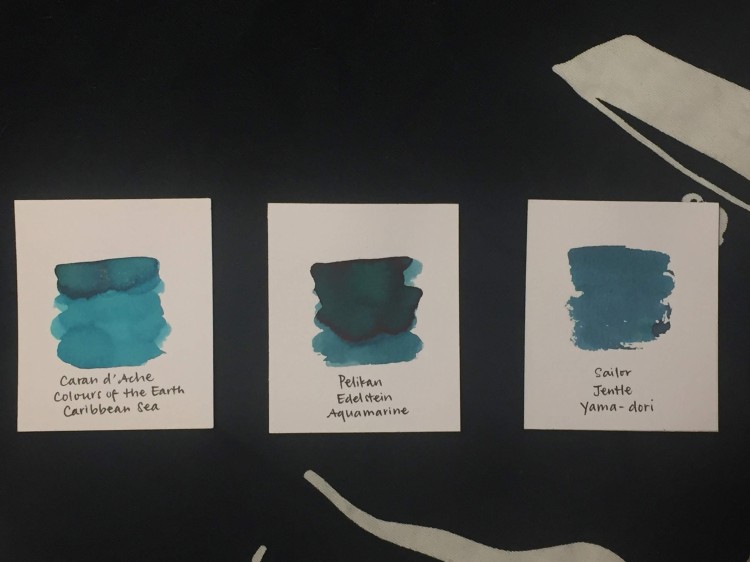
- Caribbean Sea
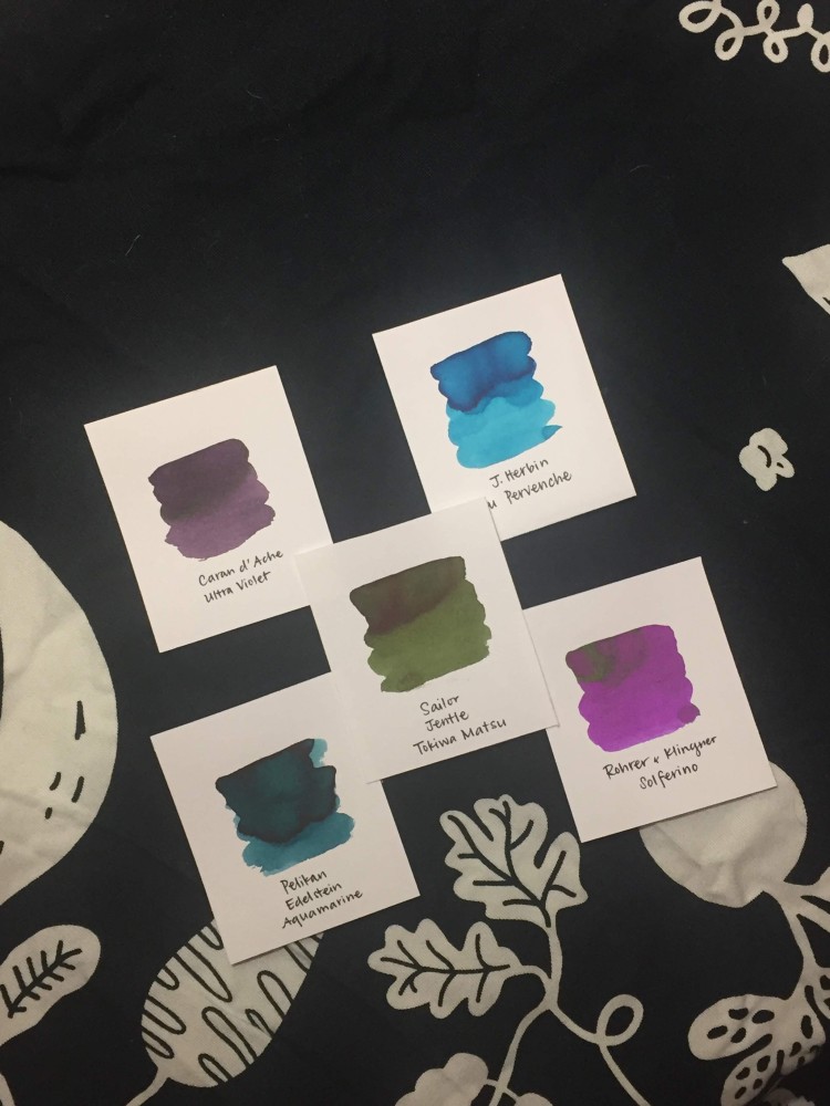
- Ultra Violet
De Atramentis
J. Herbin
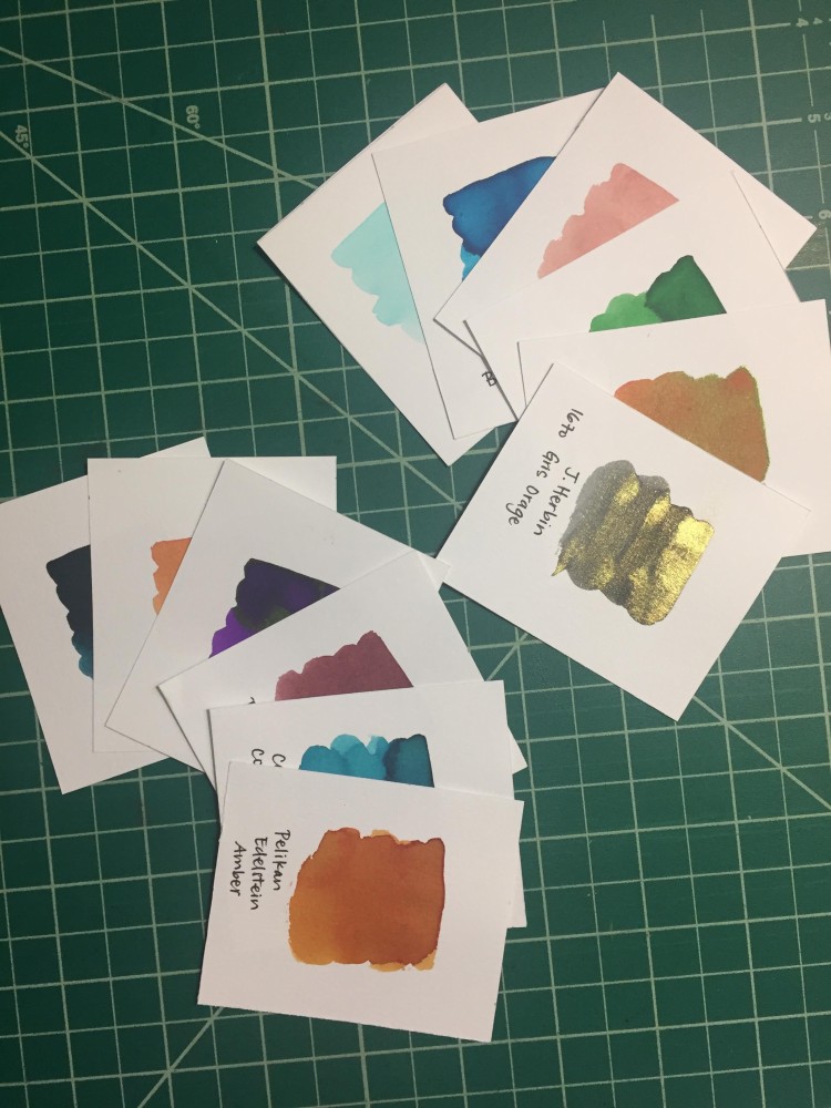
- 1670 Gris Orage (Stormy Gray)
- 1670 Hematite
- Bleu Pervenche
- Diabolo Menthe
- Lierre Sauvage
- Orange Indien
- Rouille d’ancre
- Vert Olive
KWZ
Lindauer
Mont Blanc
- Irish Green
- John F. Kennedy navy blue
- Meisterstück Blue Hour Twilight Blue
- Lavender purple
Pelikan
- Edelstein Amber
- Edelstein Amethyst
- Edelstein Aquamarine
- Edelstein Mandarin
- Edelstein Turmaline
- 4001 Königsblau
Rohrer and Klingner
- Alt-Bordeaux
- Leipziger schwarz
- Scabiosa
- Smaragdgrün
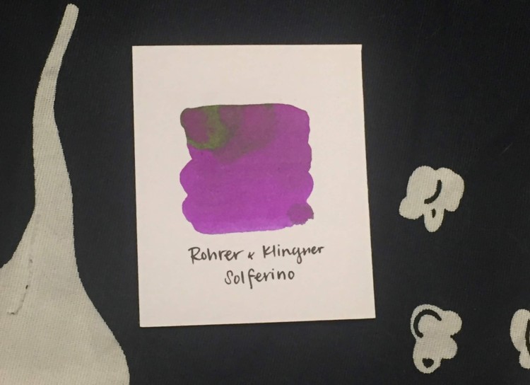
- Solferino
- Verdigris
Sailor
- Apricot
- Shigure
- Tokiwa-matsu
- Ultramarine
- Waka-iguisu
- Yama-dori
Stipula
- Black

That’s a great idea. In your average fountain pen, so you then get a line colour similar to the darker shades of the inks?
LikeLike
It is hard to say. If I let the ink sit in the converter for a day or two, the first line may resemble the darkest hue in the swatch. Vice versa, if I use the pen daily, the color is more so in the light/medium one. Some nib brings out the shading quality of an ink more so than others, so you get a spectrum.
LikeLiked by 1 person
A lovely post: great idea and great photos.
LikeLike
Thank you for the compliment and stopping by!
LikeLike
Great idea with the paper and the brush. I used big box store index cards that certainly can be considered white but they are still good for comparing one color to another. I have stayed pretty consistent every time I get a new ink or sample.
LikeLike
Using what you have on hand is great. Do index card withstand ink wash well? I have a huge pad of the Canson paper I have mentioned, figure it may be a good way to use them up!
LikeLike