Following its previous ink releasing pattern, in 2016 Sailor “resurrected” limited edition from years before. When I caught a glimpse of orange in the rotation, I immediately thought Sailor has brought back the coveted and beloved Apricot. Since Sailor ink priced a bit lower overseas (a little over 10 USD versus 18 USD in the States), my sister graciously brought a bottle back from home.

The first impression after making a swatch is its striking similarity to Pilot Iroshizuku Fuyu-gaki, the bright vermillion as seen below:

Kin-Mokusei, though, is not entirely vermillion. The bottom left corner of the swatch shows a tint of orange. In a line-up for all the orange ink in my possession, Kin-Mokusei comparatively has less yellow undertone than the rest.


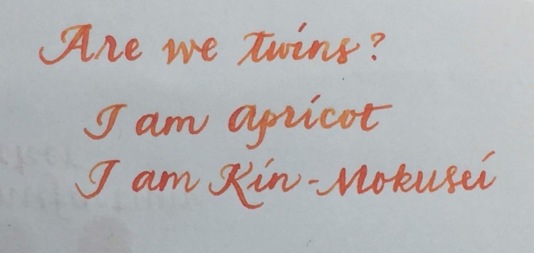
When I inked the Platinum Century 3667 with soft-fine nib, the orange hue reveals itself more. Against a white background, the color is a reddish orange. The scanned write-up page at the beginning of this post is probably the most orange, but to me equally pleasant.
Similar to other Sailor ink, it is a well-behaved ink that is friendly to most paper varieties. In a regular nib, the ink dries fairly quickly that will prevent any accidental fingerprints. It does not shade crazily like Pelikan Edelstein Amber, but it is not exactly monotone; the writing sample shows a good gradients of orange. The ink is not water resistant, but it can stand a light wash. I have done two different water resistance tests with this ink. One is to simply do a one-stroke wash with a water brush, as seen in the bottom right corner of the pictures. The ink is smeared, but you can still see the original text. The second test involves squirting spurt of water from a syringe. At the initial point of impact, the water dissolves the ink into an orange puddle, while the text in the peripheral area stays somewhat intact with some splash marks. The picture on the right show how it looks when the puddle completely dries, you see a mix of red (what is left of the original text) and orange.


Having used the ink for three weeks now, I have not noticed any iridescent sheen, but it seems to have a glistening quality to it. When looking at Kin-Mokusei swatch at an angle, it seems to be glossier than other ink.
Here comes the question of the hour: How similar is Kin-Mokusei to Apricot? The written comparison between the two is subtle. To my eyes, Apricot’s yellow tone is more prominent than Kin-Mokusei. A quick water test on both ink also confirms that.


My take on this color is if you are absolutely mad about orange and do not get a chance to get a bottle of Apricot, Kin-Mokusei is a nice addition to the rotation, giving a pop of color. If you already have a dozen bottles of Apricot, you can make room for other great choices in this Sailor release. Do I regret my choice? Not a bit, since Sailor is probably my favorite ink and I am running out of Apricot. Kin-Mokusei is a rich and warming color that can brighten up anyone’s day.
This ink can be purchased at Sailor authorized retailers, such as Vanness Pens and JetPens.*
Do you like any bright color fountain pen ink?

Hello Plume poétique (Poetic Nib) 😉
The way you compare the inks is very interesting.
I don’t know if I am Apricot or Kin Mokusei. I hesited for Apricot during a long time. So long that when I decided to try it : “out of stock” and later “discontinuation”… I am very speedy. At last, I bought “Yu Yake” for the shading. And soon, I will receive my first Sailor ink.*
Orange indien (J. Herbin) is too “monotone” for my eyesight. I fell in a deep sleep when I wrote with.
I prefer shading fountain pen ink.
Your writing with the Soft Fine Platinum 3776 is wonderful ! I can’t do like you.
* Guess : what is the color choosen ?
LikeLike
When it comes to stationery I am more of a tortoise than a hare. Granted, I may have miss some truly gorgeous ink and pens, but I think it is more important to enjoy and love you already have.
Hmm..I am guessing you are either getting a Kin-Mokusei or yama-dori. At least for me it is difficult to decide which Sailor ink to buy, since all of them look beautiful. You may have already tried it, I think J. Herbin ink is a great match to Rhodia paper. It is something I observe that though some J. Herbin ink is nearly transparent (e.g. Diabolo Menthe), Rhodia paper helps bringing out the shading quality.
Thanks for your kind compliment. Everyone can write beautifully, c’est en forgeant qu’on devient forgeron, n’est-ce pas?
LikeLike
I enjoy colors and colors’inks, of course. I regret “Safran” Caran d’Ache, “Pink” Montblanc. I get enough for the limited editions ! Now I need to know other different colours. And when I’m looking at some colours on the web, they seem similar to some I have already.
Yes, I know some J. Herbin’s inks. Very waterly, transparent, light. I use with fountain pens & dip pen (Bandzug : the only I can write with). I appreciate ! I never tested “Diabolo menthe”. When I re-began writing with these inks, a lot of blue that I don’t like now. “Eclat de saphir” is bright, “Pensée violette” more, even flashy, too much for me. I prefer the shading “Lierre sauvage”, more with “Lie de thé”. “Terre de feu” has a bite less shading, but is different : rather “old rose” with an extra-fine nib, brown red pinkish with a fine nib. I’ve let the little bottle (10 ml) “Terre de feu” open, covered with a “light medical tissu” during one month, It seems now less watery and definitly darker. Most of the time, I use Rhodia notebooks and sheets for “correspondance”. “Tomoe river” white sheets paper is also amazing. I will post a message on your review “Clairefontaine”. 😉
The next Sailor ink is not Kin-Mokusei. I hesited for Yama-dori and finaly it is another… Guess : what else ?
You know some specific french terms, not the most easiest. Sur that you speak french better than you think.
LikeLike
I was very dubious about colorful ink when I rekindled my interests for fountain pens, but it is evident that I have quickly abandoned that ban. Judging colors on computer screen can be difficult too, since it depends on how the picture of the original was taken, as well as how your computer resolution is. That is why it is a blessing if you can test the ink at a physical store before purchasing. Though, most stores nowadays sell ink samples, so you can at least try the ink before committing to the whole bottle.
Tomoe River paper is truly dreamy; it can even take some light watercolor wash!
LikeLike
Most of reviews show inks written with medium nibs and more widest. When you use fine nibs, results can be very different. Where I live, there is not a lot of stationnaries for fountain pens and inks. The rare where I can find some of them, choices are poor. Don’t think about ink tests ! Maybe only if there is an oportunity for testing fountain pens with a blue or black ink ! And when I tested fountain pens, there was not chair. Doing it standing up is not the best condition for testings ! It seems that in France, people don’t write a lot with fountain pens. Compare to other countries. Most of the time, I even have to buy french products via international shops lines.
LikeLike
Fountain pens, at least in the US, is still a niche market; people are amazed that I always carry one around and is my preferred writing instrument. I would imagine that it is more accessible in Europe, but I guess my assumption is erroneous. I miss the days when fountain pens were used in elementary schools!
If you are lucky and have a friend who shares the same interests on ink and pens, perhaps ink swap would be a good idea to try out different shades, especially when physical stores for fine stationery is lacking.
LikeLike
So, I suppose that fountain pens are a niche market (marché de niche) in French too. I read reviews about them, most of the time, from America and U.K. consumers, lovers… That’s why it makes me think that they are rare in France. I never heard that at school, foutain pens were generaly used. I began after primary school. I don’t remember if we were a lot. Yes, the best way to test inks is knowing people. Next, it is necessary that people the same tasts.
LikeLike
I started using fountain pen at 9. Now if I think back that was an extraordinary of trust that the child won’t make a mess.
Finding perfect shades of ink is always a challenge, but at least the process is fun!
LikeLike
Fountain pen is something that we don’t forget. And it seems that to write with again, we have to get time.
Yes, finding shades is a challenge, full of curisioties, suspens, wait, discoveries, joys, bad surprises… That’s the game too.
LikeLike
I would cherish the process and the game as Françoise Héritier called it, the sweetness of life 🙂
LikeLike
My first Sailor ink will come tomorrow ,-)
LikeLike
Hm, Rikyu-cha?
LikeLike
Rather S….a M..i
😉
It is very surprising : some months ago, I still hated this color.
LikeLike
Ah, Sakura-mori. It is a rather romantic color, at least from what I have seen in pictures. If it does not work out as a writing ink, it may be used as a highlighter
LikeLike
I was looking for a soft ink. To be soft, Sakura Mori is ! I can read it with a fine nib Kaweco. I found “Tsutsuji – Iroshizuku” too bright and magenta, not really deep pink… I feel it is time to make a “pink ink bread”…
LikeLike
break 😦
LikeLike
Glad that Sakura-mori is performing to your expectation 🙂 I am still not courageous enough to get a soft pink yet. Perhaps I should try out a sample.
LikeLike
Where did you purchase the Manufactum Ocker ink? I absolutely love the color/shading/tone of the ink but I can’t seem to find anyone that sells it. Thanks!
LikeLike
It was a gift from Germany, sold in a lifestyle store called Manufactum. It does have an online presence, but I am uncertain whether this ink is still sold. Good luck with your search!
LikeLiked by 1 person