I have always wondered how similar are the Pilot Falcon and Platinum Century soft fine (SF) nibs. This curiosity was left on the back burner for several years because many fountain pen enthusiasts commented on how Platinum’s SF nib does not flex as much compared to Falcon. Curiosity kills a cat. More than a year ago I purchased a Platinum Century with SF nib on Amazon on a whim and it is a road with no return.
Both Platinum Century SF and Pilot Namiki Falcon have 14K gold nibs and they do shape slightly different. Falcon, as its name indicates, resembles a falcon’s beak, while Platinum Century has a rather normal looking nib, sweetened by a heart-shaped breather hole. The Platinum SF works right out of the box and seems to be easier to use compared to Falcon. This perception can be skewed since I have more exposure to flex nib now than five years ago, but it is amazing how easy it is to achieve line variation with Platinum SF than Pilot SF, probably because the Platinum nib is stiffer. In my opinion, the Platinum SF nib is more beginner friendly, since users can easily control a hard nib than a soft one. The hardness of the nib also discourages one to press down further. It is significantly easier to write normally, without flexing, with a Platinum Century than a Faclon. When I used Falcon for the first time, it took me awhile to print or write cursive normally without flexing; in fact, I adjusted how I hold the pen and slow down significantly to get a hang of the pen. In contrast, I can write with a Platinum SF nib at a normal speed without skipping and with a finer line. In this light, Platinum SF nib is a bit more versatile if your end goal is to be able to print normally and add a bit of flourish from time to time.


Nib choices with the Platinum Century series also make the pen a salient choice. The body shape may remain the same, but one can choose from UEF (ultra extra fine) to Music. It also comes in a variety of standard as well as limited edition colors (Have you seen the newest release?) Because I had such a great experience with Platinum Century (and because I am such a sucker for colors), I picked up another Century with a UEF nib while going home in 2016. With the exchange rate at the time, the pen cost roughly $84 USD and it came with a cartridge, a converter, as well as a complimentary One over One Studio ippitsu-sen (short correspondent paper; Sola has written a post about this uniquely Japanese stationery here) made with bank paper. UEF is favored by many artists and illustrators for its crisp and delicate line. In addition, the UEF nib allows one to write legibly in a small space. One note of caution, finer the nib, scratchier it may feel on paper because the point of contact between the nib and paper is minuscule. The nib also picks up paper fiber easier given how sharp it is, so when using a UEF nib (or a finer size for that matter), use smoother paper to be on the safe side.
When I first picked up the UEF, I was afraid that I have fallen into the pitfall of “the finest nib quest” but my doubt was quickly dispelled. Compare to other Japanese F or EF nib, UEF feels significantly firmer. Since it is a harder nib, when writing quickly, you can hear the sound of nib gliding over the paper surface. A notable concern for a fine nib is that it is prone to clogging, especially when one uses a metallic ink (J. Herbin 1670 series, for example). Though I have not yet inked the UEF with any shimmering ink since Platinum’s nib can be easily removed in the same fashion as a Lamy (with a piece of tape), deep cleaning would be a non-issue.
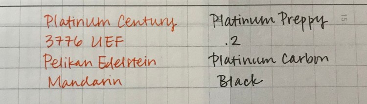
From the pictures below, one can observe the similarities among Platinum Century UEF, Preppy .2, and Pilot Kaküno EF. I would recommend a Preppy .2 if UEF has been on the wanted list, but you are unsure whether you would love it. The downside of Preppy is its flawed body material; the plastic seemed very brittle that cracks start to show even though the pen has never been dropped. Kaküno is far more superior in terms of material, but the nib can be dry because Pilot does not have the famed slip and seal mechanism. UEF has the most feedback among the three and pair with paper such as Midori or Tomoe, is a heavenly experience.

While I have picked up standard black for SEF, I opted for Chartres blue for the UEF. As its name suggested the material is translucent and when one holds it to the light, it evokes images of the stained glass from Chartres Cathedral.


I have thoroughly enjoyed my experience with Platinum Century, and you can definitely call it “love at first write.” For the combination of price, nib options, and performance, it can easily fit the criteria of a grail pen for enthusiasts with a budget in mind.
What is your recommendation for the next-step pen?


Thank you for that thorough comparison! – Do you have the Platinum Carbon pen? If yes, how does it compare to the Platinum Century UEF?
LikeLiked by 1 person
Though I do not have a Platinum Carbon pen, a friend of mine has. In her observation, Carbon pen writes like a F. It is a fantastic pairing with Platinum Carbon ink.
LikeLiked by 1 person
Thank you for that detail!
LikeLiked by 1 person
J’admire ce que d’une plume réputée rigide, conçue pour l’écriture Kanji, vous en faites. Très belle comparaison entre ces deux plumes !
LikeLiked by 1 person
Merci pour en lire! Je n’ai jamais pensé à ça! La plume rigide on permet d’écrire rapidement avec précise ligne. J’aime les stylos à plume de Platinum très bien. Avez-vous essayé les encres de Platinum? Ils sont résistant á l’eau et leur teints sont trés jolies!
LikeLiked by 1 person
Les plumes Platinum Century & Crystal Balance Fine sont effectivement très précises, c’est appréciable !
Je n’ai malheureusement pas vraiment essayé des encres Platinum. Peut-être des cartouches bleu ou bleu-noir livrées avec les stylos-plumes Crystal Balance. L’encre était peut-être pigmentée.
Bonne année, sous le signe du Chien 😉
LikeLiked by 1 person
Encres Platinum ne sont pas très palpitants jusqu’ici. Vous pouvez les voir ici: http://www.platinum-pen.co.jp/products/spare/ink/eink.html
J’aime “Citrus Black” et “Sepia Black” particulièrement.
Merci pour les salutations de la nouvelle année chinoise!
LikeLiked by 1 person
Le choix des encres Platinum est assez restreint. La marque avait proposé des encres à mixer, personnaliser. J’ignore si elles ont du du succès.
Vous avez bon goût en matière d’encres.
Sinon, j’aurais une préférence pour “Cassis black”. En ce moment, je recherche des encres roses et grises.
“Malvenrot marsmallow” de StandardgrapH est d’une jolie nuance, mais l’encre est assez sèche, manque de lubrification.
LikeLiked by 1 person
Thank you for showing this pen. I love my Falcon, but even though I only transport it nib up I often end up with a mess and ink in the cap. Is the Century better?
LikeLiked by 1 person
I have not yet have the ink pooling problem in the cap for Century and I have carried it to places without being in a nib up position. Recalling from our previous conversation, you felt reserved on flexing Falcon, since the nib is soft. You might want to give Century a try as the nib is stiffer so you can write normally and achieve the flex with only small amount of pressure.
LikeLiked by 1 person