(All images can be enlarged to see a closer up look and details)
This post is not meant as a review, as I am by no mean a professional calligrapher. It is more of an impression and experience post on two items I recently tried out.
Ever since I started doing calligraphy, I have a fear for metallic ink. It does look pretty, but I either get an ink glob on paper or the nib is so clog with ink that it does not want to write. After years of hiatus and learning some tips from
Gentian, I finally have enough courage to give metallic ink and non-italic dipping nib another try.
The ink I am using here is one of the bottles from J. Herbin Pearlescent Ink Sampler Pack. The benefit of a sampler pack is that you can try out 5 colors in smaller amount, a good way to judge whether you like it. Each color is also sold individually in a larger capacity. Do not use this ink with fountain pen. The pigment and viscosity will definitely clog the feed. It is meant for dipping pens only. I have used brush pen with it as well. Instead of filling the ink, I just dip the brush tip in ink.
|

|
J. Herbin Pearlescent ink from sample pack.
The glass vial can be reused as ink storage. |
Before using the ink, give it a good shake, so the pearlescent pigment will incorporate well with the ink mixture. Perhaps I have not used the ink after acquiring it, I found the ink thicker than usual and it does not flow as well. My way of solving this problem is to dip the nib in water and gently mix it with the pearlescent ink. It will make the ink flow a bit better.
Instead of dipping strait into the bottle, I pour a bit out to a watercolor palette, so I can add droplets of water and mix easily.
 |
| The set up. Water palette, Strathmore sketchbook, and dipping pen |
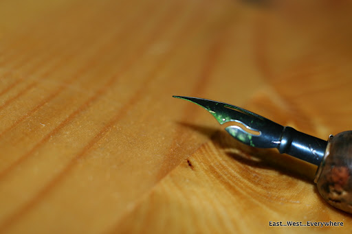
Here comes the second part of my longterm fear, the dipping nib. I acquired a set of Writing and Calligraphy set by Brause awhile back. I am happy and can use the italic nibs, but have trouble with Stenofeder (Blue Pumpkin), Pfannenfeder, and Citofein. All three nibs can flex beautifully, the problem is I could not get them to write. It turns out that there is residual oil from the manufacturing process on the nibs, so before you use them, give them a good scrub (I usually use a soft bristle toothbrush to gently remove ink).
Blue Pumpkin looks rather beautiful. The dark metallic blue color makes the nib looks elegant. When I used it with regular fountain pen ink, because the ink consistency is so thin, it does not coat the nib well. Blue Pumpkin is a VERY thirsty nib; most of the ink just gushes out with the first stroke. It does not help that I write heavyhanded, so the nib creates a lot of train tracks (totally my fault because I overflexed).
 |
| Blue Pumpkin with Koh-I-Noor cork nib holder. |
 |
| Isn’t she a beauty? |
 |
| Back side of Blue Pumpkin, with a bit of J. Herbin Pearlescent green. |
 |
| Look at that nib curvature. It reminds me of the beak of a hummingbird. |
 |
| Just another look. |
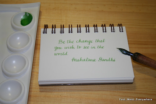
So what do I do differently? I use a sketchbook because the paper is a bit toothy, and for some reason it helps with the writing. I also slow down my writing speed tremendously, as if I am writing on the moon. Another good advice I got from Gentian is just write normally at first, so you became acquainted with the nib. After you are comfortable with the nib, flex the nib lightly and slowly to observe variation of lines you can make with this lovely nib. Letters written by the metallic ink appear rise slightly on the paper surface, creating an embossing effect.
 |
| Writing sample |
 |
| The nib got potential! Look at the lines it can make! |
 |
One thing I really like about J. Herbin Pearlescent ink
is that it is not overpoweringly glittery.
If you enlarge the image, you can catch some of the glitter! |
Want to try it out?
Nib
Ink


Ahhh, great handwriting. I adore!!! And it is a very nice green.
LikeLike
Thank you Zeynep. You are always so kind! J Herbin's pearlescent ink has nice color.
LikeLike
It looks great! I'm glad it worked. The Steno is such a nice nib 🙂
LikeLike
Thank you for all your help? Now I wonder whether J. Herbin's metallic ink is better or I have just misused it all this time :p
LikeLike
That's my favourite nib, but I didn't know it's called the “Blue Pumpkin”. I just wanted to order a new one, because one of my two of those nibs was damaged recently, so I searched the internet for Brause 361 and realised your review is actually about 'my' nib. I wish they made fountain pen nibs like that. My Lamy 2000 M nib is quite flexible so I ordered a Lamy 2000 EF, too, a year or two ago – hoping it would be a bit like the Brause 361, but it isn't…
LikeLike
“Blue Pumpkin” : the color should refer to the “steel blue” after “forging”. Pumpkin because of the form ?
LikeLike
The shape of the nib somehow reminds people of pumpkin, though I thought the profile resembles a hummingbird’s beak (le colibri). I am so bad with numbers, so the nomenclature “blue pumpkin” actually helps me remembering it!
LikeLike
You are incredible ! Where people see a pumpkin, you see the beak of the colibri. Yes, of course, my favourite bird ! Your description is full of poetry. I like it 😉
LikeLike
Perhaps it is all subconscious, as pumpkin is not my favorite, but I am glad that you get the simile 🙂
LikeLike
I am not sure whether the feed for Noodler will fit Brause 361, since the nib does have quite a bit of curvature. Have you ever read Brause Rose nib? It is even more flexible than 361. Try it out when you have a chance!
LikeLike
Beautiful review ! I tried it out. But just tried. 😦 Ink was probably too watery.
LikeLike
I have to say it was quite tricky to work with pearlescent ink; the consistency can be an issue. If you are willing, gouache and watercolor might be less finicky since you can adjust the thickness of the mixture. Bonne chance!
LikeLike
Merci beaucoup for your help ! I And you remind me that I have two ink bottles Winsor & Newton for calligraphy. Before, I mixed ink (for fountain pen) with arabic gum. It was very difficult for me finding the good flow. I have a little bottle ink “Chocolat” J. Herbin for calligraphy. But the color is very dull. And for a beginer (in 2012) your writting was already very beautiful.I don’t speak english fluently, but I enjoy reading your poetic style.
LikeLike
I am glad that you find my suggestion helpful! Do not worry about your English; only if my written French was half as good as your English. I found J. Herbin’s calligraphy ink a hit and miss, so to kill two bird with one stone I often use watercolor or acrylic if I am using a dip nib, since these media “cling” better to the nib.
LikeLike
What acrylic do you use ?
“to kill two birds with a stone” : in french, we say “pour faire d’une pierre deux coups”. 🙂
LikeLike
I use Holbein Acryla Artists’ Acrylics, but I believe any acrylic that you can find at an art supply store will do. Dip pens are more tolerant than fountain pens when it comes to media 🙂
LikeLike
Thank you for your advices. Another inks do test 😉
LikeLike
There is always one more thing to test. Not sure whether this is a fortune or calamity? 😉
LikeLike
L.O.L. I won’t answer…
LikeLike
It is a blessing to my well-being, but a calamity to my wallet 😉
LikeLike
Another inks To test… They won’t test by themselves.
LikeLike