Sometime I have absolutely no clue on how I encounter some of the ink brands. De Atramentis, for example, is one I can no longer recall. I might have seen it on Art Brown International Pen Shop’s website, and searched the brand on the web. Several elements of ink grasped my attention; one being it is handmade in batches, which implies that colors will vary from one shipment to the other. Another point of attraction is that it has many different series, and one of them is entirely dedicated to historical figures and music composers. If I recalled correctly, Mozart is red (befitting for his flamboyant personality), and Beethovan is sepia brown. Because it was not widely distributed in the US, many times I was tempted to ask my German friend to snatch a bottle for me, but for some reason, I never made the request.
Just one day while perusing on Goulet Pens’ website, I surprisingly discovered that now they carried De Atramentis ink!!! To an addict, that was an invitation to purchase. But look at all these colors! Which one should I choose? This choice is probably harder to make than my college major, which does not put me in a better light. While I was ruminating over what kind of damage that I ought to make, I saw the plum blue. Immediately, I was captivated because not only it was not a color I do not have, but it was also was scented. To those who know me well, I truly believe that writing should be a holistic experience that includes visual and sensual enjoyment, and I speculate that this particular ink could fulfill that requirement.
One thing I have to say about De Atramentis is that the website does not disclose too much information about their products. It is handmade and it uses dyes and materials that comply to EN-71, the European toy safety standard. To have a more in-depth background on this ink, please visit Glenn’s Pen Review.
The packaging itself is very traditional and adorable in some respects.

To me, the bottle looks like a top hat with a little stand. It is not as ornate as Pelikan Edelstein, but the simplicity of it is also very appealing. I found the bottom round disk-shaped base interesting. I thought that would add stability to the ink bottle, so it will not tipped over easily by someone clumsy like me.
 |
| Here is a top-down view of the ink. The hue of the ink is more visible on the cap |
 |
| One last look of the color. Is it not beautiful? This picture was taken while I flushed the Pelikan M205. |
While flushing out the Pelikan M205 Duo, I found the droplets of ink in water were also good indication of the color and its hue. The darker droplet is the initial drop as I twisted the piston fill, then I just saw the color diffused and radiated, to this cross between Cerulean and teal.
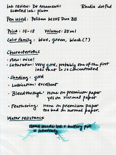

To recall from my reviews in J. Herbin’s scented ink, I observed that the saturation of this ink seemed to be lighter than regular ink. This is not the case with De Atramentis Plum Blue. It is worth noting that the pen I used here had something to do with the high saturation. Pelikan M205 Duo was a wet pen, which its double broad nib probably contributed to it. The pen factor also led to the prolong drying time, but as for this ink, it was definitely worth the wait, since you could enjoy the aroma while at it. Another interesting factor of the ink was the water resistance section. If an ink had no water resistance property, most likely the phrase will turn into an ink blob. As far as I know, water resistance was not advertised by De Atramentis ink, but as you can see in the writing sample, you can still read the phrase I wrote underneath. When I saw the phrase still intact I added couple more stroke with a brush pen, but it only released a bit more hue, which I utilized to improvise a pretty miserable looking branch. I assume that for artists who are fond of water color could give this ink a try!
All in all, this is a great ink that I would recommend to fountain pen lovers. Granted the price is a bit steep ($15-18 for 35ml), but it is well worth it for a handmade ink. I believe this is as close as custom made ink to avid pen fans with a budget.

Wonderful, wonderful review. I really like this color. Even though I don't generally care for scented inks I may have to add this to the list of inks to try out.
LikeLike
I am glad you like it! After trying J.Herbin's scented ink, I was about to give up on scented ink, but De A is just hard to pass up.
LikeLike
Thank you for liking my review! I think I have covered a bit more grounds on this one than other. I do realize that I totally left out how De Atramentis is on normal printing paper, as well as on a finer nib. I guess that will be a follow-up!
LikeLike
Your ink reviews are awesome! I also love the new lay out 😀 This ink is so cool. What a gorgeous color. I love love love that picture of the ink in water. That's one of my favorite things ever – it totally shows the range of colors nicely.
LikeLike